The EPSS Model
Motivation
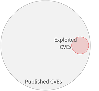
Vulnerability remediation has some fundamental truths. First, there are too many vulnerabilities to fix them all immediately. Past research has shown that firms are able to fix between 5% and 20% of known vulnerabilities per month. Secondly, only a small subset (2%-7% of published vulnerabilities are ever seen to be exploited in the wild. These truths set up both the need and the justification for good prioritization techniques since firms both cannot and do not need to fix everything immediately.
Therefore, what is the optimal prioritization strategy when remediating vulnerabilities? Unfortunately, there is no one single answer to that question, but instead lies with a collection of metrics to help inform and guide the prioritization decisions, which is where this research comes in.
The Exploit Prediction Scoring System (EPSS) is a community-driven effort to combine descriptive information about vulnerabilities (CVEs) with evidence of actual exploitation in-the-wild. By collecting and analyzing these data, EPSS seeks to improve vulnerability prioritization by estimating the likelihood that a vulnerability will be exploited. The EPSS model produces a probability score between 0 and 1 (0% and 100%). The higher the score, the greater the probability that a vulnerability will be exploited (in the next 30 days).
Data Architecture and Sources
EPSS was first developed in the summer of 2019 and initially presented at BlackHat that same year. Since then, a Special Interest Group (SIG) has been working hard at FIRST to build a scalable computing infrastructure to ingest and process multiple data sources. In fact, through community partnerships and the work of EPSS SIG members, EPSS is currently collecting multiple different data sources, most of them daily including but not limited to the following list:
- MITRE’s CVE List - Only CVEs in the “published” state are scored
- Text-based “Tags” derived from the CVE description and other sources talking about the vulnerability
- Count of how many days the CVE has been published
- Count of how many references are listed in the CVE
- Published Exploit code in any of: Metasploit, ExploitDB and/or Github
- Security Scanners: Jaeles, Intrigue, Nuclei, sn1per
- CVSS v3 vectors in the base score (not the score or any subscores) as published in the National Vulnerability Database (NVD)
- CPE (vendor) information as published in NVD
- Ground Truth: Daily observations of exploitation-in-the-wild activity from AlienVault and Fortinet.
The current EPSS model (v2022.01.01) was trained with 1,164 variables, most of which were boolean values representing the presence of a specific attribute (i.e. was Microsoft the vendor? Does this CVE have an exploit included in the metasploit framework?). Details about the full model development of earlier models are available in our research papers (see links below). The current model was trained with Gradient Boosting, specifically poisson rate with exposure.
To discuss model performance, let’s begin with a simple strategy of remediating all CVEs with a CVSS base score of 7 and above. In order to measure the quality of this approach, we need an outcome measure. In this case, we get the outcome measure by tracking vulnerabilities being exploited in the wild. This gives each vulnerability two different attributes: would we choose to remediate it or not, and was this observed as exploited or not? These two attributes enable us to put each vulnerability remediation decision into one of four categories, as shown in the figure below. The large gray circle represents all published CVEs, and all of the CVEs that were scored with 7 or higher with CVSS are shown in blue. And finally all of the CVEs that we observed as being exploited are shown in red.
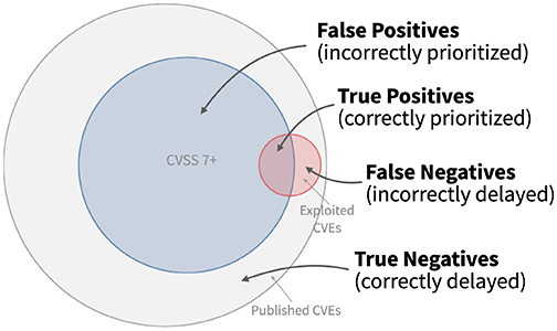
- True positives (TP) are the good decisions – the prioritized vulnerabilities that were exploited in the wild. This is where the blue circle of remediated vulnerabilities overlaps with the exploited vulnerabilities in red.
- False positives (FP) are vulnerabilities that were prioritized, but not exploited. These decisions represent potentially wasted resources and are in the blue circle of remediated vulnerabilities that did not overlap with the red circle of exploited vulnerabilities.
- False negatives (FN) are vulnerabilities that were not prioritized (and not remediated) but were observed to be exploited in the wild. These are the vulnerabilities in the red circle not being overlapped by the remediated vulnerabilities in the blue circle.
- True Negatives (TN) are vulnerabilities not prioritized and not exploited, these are the vulnerabilities in the outer gray circle that were neither remediated nor exploited in the wild.
As the figure above shows, the strategy to remediate based on CVSS 7+ produces many false positives (the blue part not overlapping the red) and still leaves about half of the exploited vulnerabilities open and waiting to be remediated (the red not overlapped by the blue).
Efficiency and Coverage
Using these four categories (TP, FP, FN, TN) we can derive two more meaningful metrics, what we’ve termed as efficiency and coverage (or what information theory calls precision and recall respectively).
Efficiency considers how efficiently resources were spent by measuring the percent of remediated vulnerabilities that were exploited. In the above diagram, efficiency is the amount of the blue circle covered by the red circle. Remediating mostly exploited vulnerabilities would be a high efficiency rating (resources were allocated efficiently), while remediating perhaps random or mostly non-exploited vulnerabilities would result in a low efficiency rating. Efficiency is calculated as the number of exploited vulnerabilities prioritized (TP) divided by the total number of prioritized vulnerabilities (TP+FP).
Coverage is the percent of exploited vulnerabilities that were remediated, and is calculated as the number of exploited vulnerabilities prioritized (TP) divided by the total number of exploited vulnerabilities (TP + FN). In the above diagram, coverage is the amount of the red circle covered by the blue circle. Having low coverage indicates that not many of the exploited vulnerabilities were remediated with the given strategy.
Measuring and understanding both efficiency and coverage allows different firms to approach vulnerability remediation differently based on their risk tolerance and resource constraints. Firms that do not have many resources may wish to emphasize efficiency over coverage, attempting to get the best impact from the limited resources available. But for firms where resources are less constrained and security is critical for success, the emphasis can be on getting high coverage of the highest risk vulnerabilities.
Efficiency and Coverage in the real world
Let us compare how different remediation strategies would perform in the real world. We first collected the following information about each vulnerability on November 1st, 2021: the CVSS V3 base score, EPSS Version 1 score, and the newest version of EPSS (referred to as V2 here). We then recorded which vulnerabilities were exploited over the next 30 days in order to examine how each scoring system would perform. In order to make these comparable, we started with a CVSS threshold of 8.8 and above and attempted to match the same level of coverage (about 50%) in the two EPSS strategies (using v1 and v2).
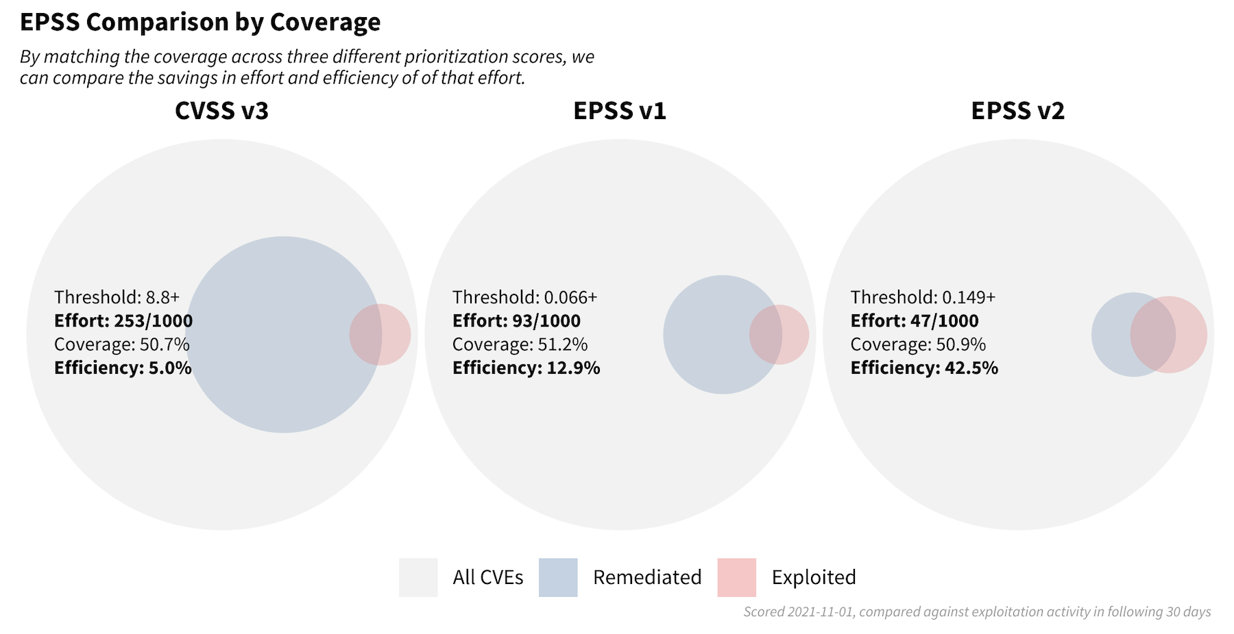
With a remediation strategy based exclusively on CVSS v3.1 and a threshold set for scores at 8.8 or higher, 253 vulnerabilities out of every 1,000 vulnerabilities would be flagged for remediation. Out of those flagged, 5% had observed exploitation activity, and of those exploited, this strategy covered about 50.7% of those.
With a strategy of EPSS v1 (developed in early 2019) and a threshold set for scores at 0.066 or higher, 93 out of every 1,000 vulnerabilities would be flagged for remediation. Out of those flagged, 12.9% had observed exploitation activity and a comparable 51.2% coverage was observed.
With a strategy of the newly released EPSS scores and a threshold set for scores 0.149 or higher, 47 out of every 1,000 vulnerabilities would be flagged for remediation. Out of those flagged, we have a large jump in efficiency up to 42.9% which maintains roughly the same amount of coverage at 50.9%.
This exercise demonstrates the enterprise resource savings obtainable by adopting EPSS as a prioritization strategy. Using EPSS v2 requires organizations to patch fewer than 20% (47/253) of the vulnerabilities they would have mitigated, compared to using strategy based on CVSS.
Maintaining Capacity
With the previous example, we tried to maintain the same level of coverage and allowed the level of effort (our remediation capacity) to shift along with the efficiency achieved. But what if we compared the different strategies and maintained the same level of effort (capacity) and just simply replaced the strategy we were employing to identify which vulnerabilities we should flag for remediation?
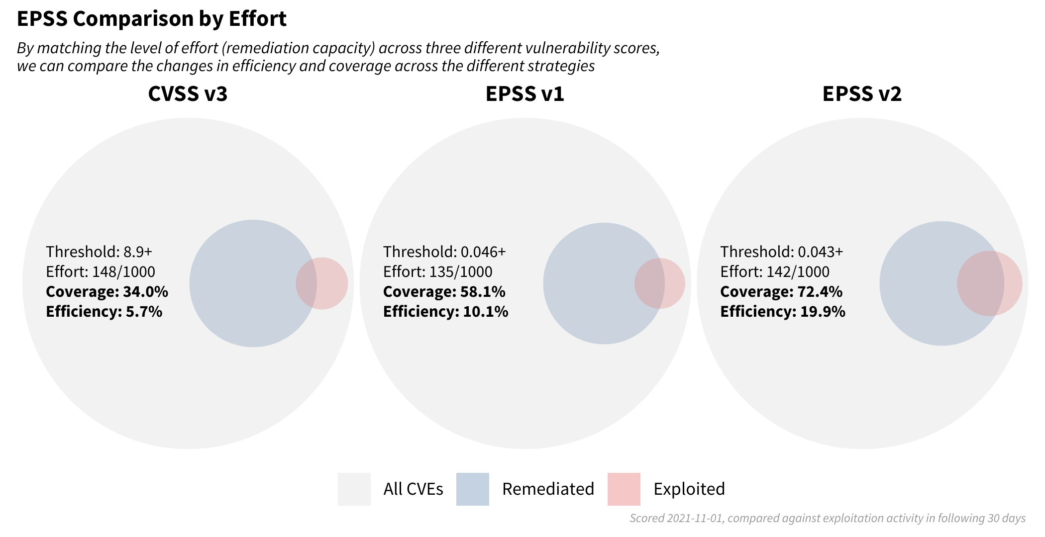
Recent research finds that the median capacity across hundreds of organizations was 15.5% so we targeted a strategy matching this finding of addressing about 150 out of every 1,000 vulnerabilities.
Note how the blue circles are approximately the same size across each of the three strategies (the set of scored CVEs were not the same across each strategy, so the red and blue circles vary slightly). However the level of efficiency and coverage are not the same. Moving from left to right in the strategies (CVSS v3, EPSS v1 to EPSS v2) we are improving in both the efficiency of remediation and the coverage of the exploited vulnerabilities. This can be summed up in the following plot:
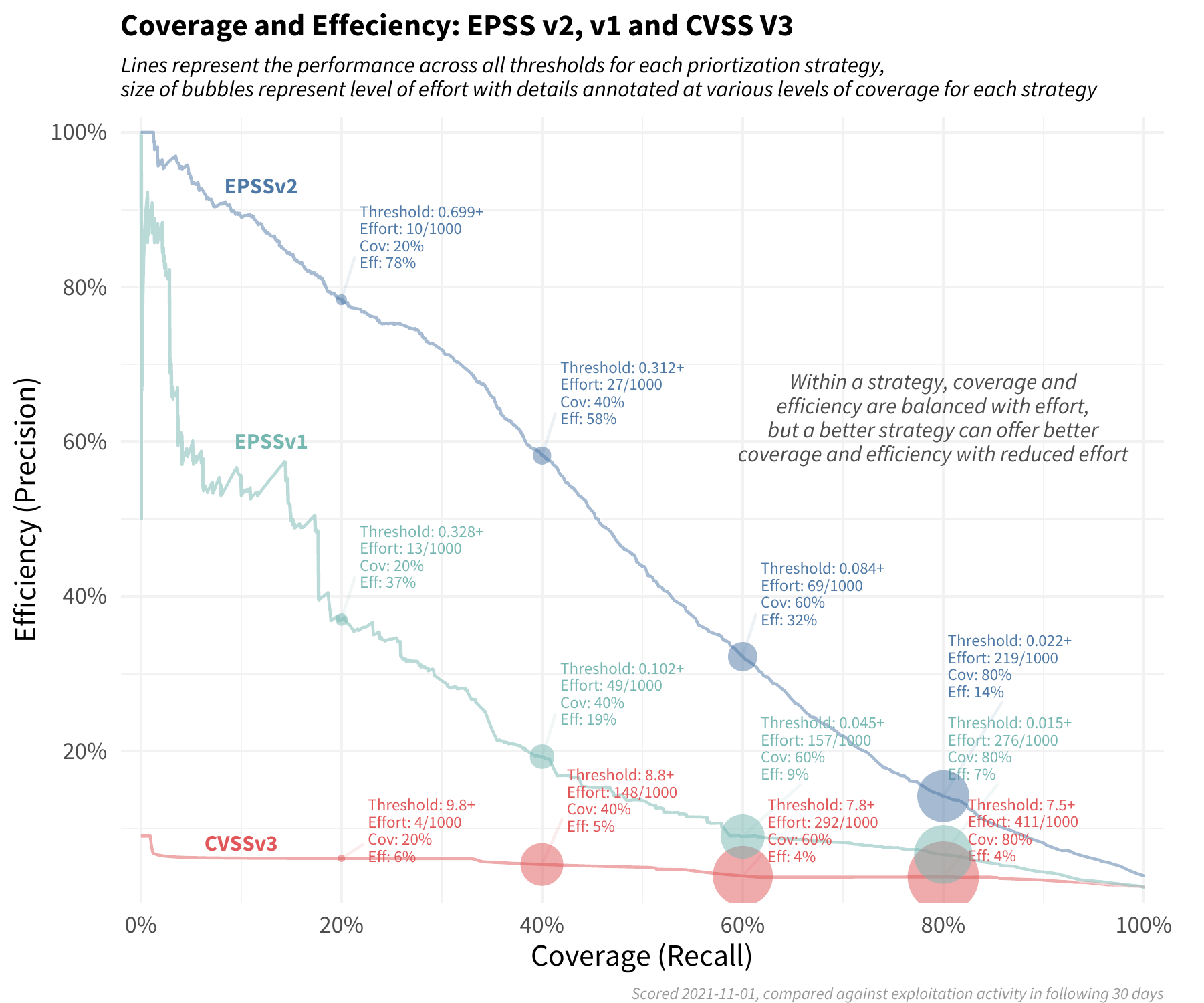
The red line across the bottom reflects a remediation strategy using CVSS v3.1 base score. Note the relatively constant level of efficiency, and in order to improve coverage we have to remediate more and more vulnerabilities at the same level of efficiency.
The green-blue middle line illustrates a strategy using EPSS v1, which achieves a higher level of efficiency and coverage than CVSS alone, though the performance has degraded since it was first developed.
The upper blue line represents the latest EPSS model. Smaller organizations can achieve remarkable efficiency with limited resources, and organizations that have more resources can achieve both better efficiency and coverage than either of the other two strategies.
Typically there is a tradeoff between coverage and efficiency, but by shifting a prioritization strategy to reference the latest EPSS scores, organizations can see a marked improvement over other existing methods available to them.
Model Interpretation
Interpreting a gradient boosted model has some challenges since it builds in interaction effects (for example, the impact of a remote code execution vulnerability may depend on whether it's in desktop software versus networking equipment). This causes the weights and contributions of variables to shift around from one vulnerability to the next, so specific contributions are difficult to extract and communicate. But there are techniques that we can leverage to give us an indication of why the outcomes are what they are.
We turn to SHAP values, which stands for SHapley Additive exPlanations, which was developed to understand the contributions of variables inside the model. As a quick means of introducing the concept, each observation (CVE) is analyzed and marginal contributions are calculated for each input variable. The challenge, as mentioned, is that the contributions of each variable can shift from one CVE to the next.
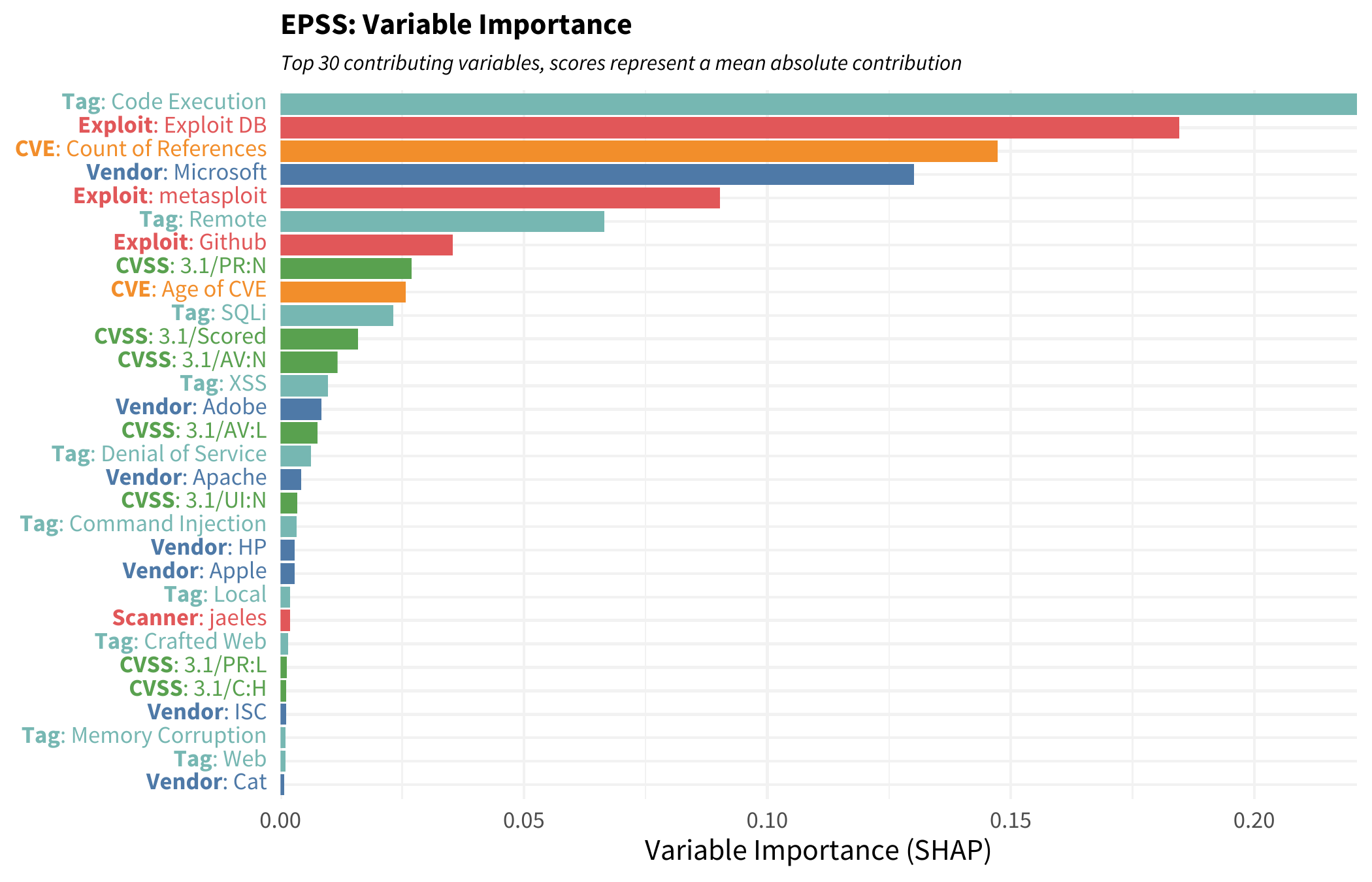
The figure below shows the top variables sorted by their contribution. Anyone who’s been around vulnerabilities shouldn’t be surprised at what tops this list. Having exploit code published and easily available for a remote code execution vulnerability with no privilege required on a Microsoft product would probably see exploitation activity. BUT that interpretation falls into a pitfall with this type of view. Just because something ranks high in this chart does not necessarily mean it positively contributes to exploitation activity. It may be that the contribution is negative for a variable but still contributes and has an effect on the score.
To understand individual contributions, we can break out each variable and plot each SHAP value depending on the value of that variable. In the following plot, focus on the CVE variable counting the number of references mentioned in the published CVE. If a CVE has a single reference, we would probably see a reduction in the outcome (the probability of exploitation) since the points are generally below zero. But as a CVE gets more references it tends to cross over into a positive contribution. It looks as though any CVE with more than 10 (-ish or so) references will have an increased likelihood of being exploited in the wild.
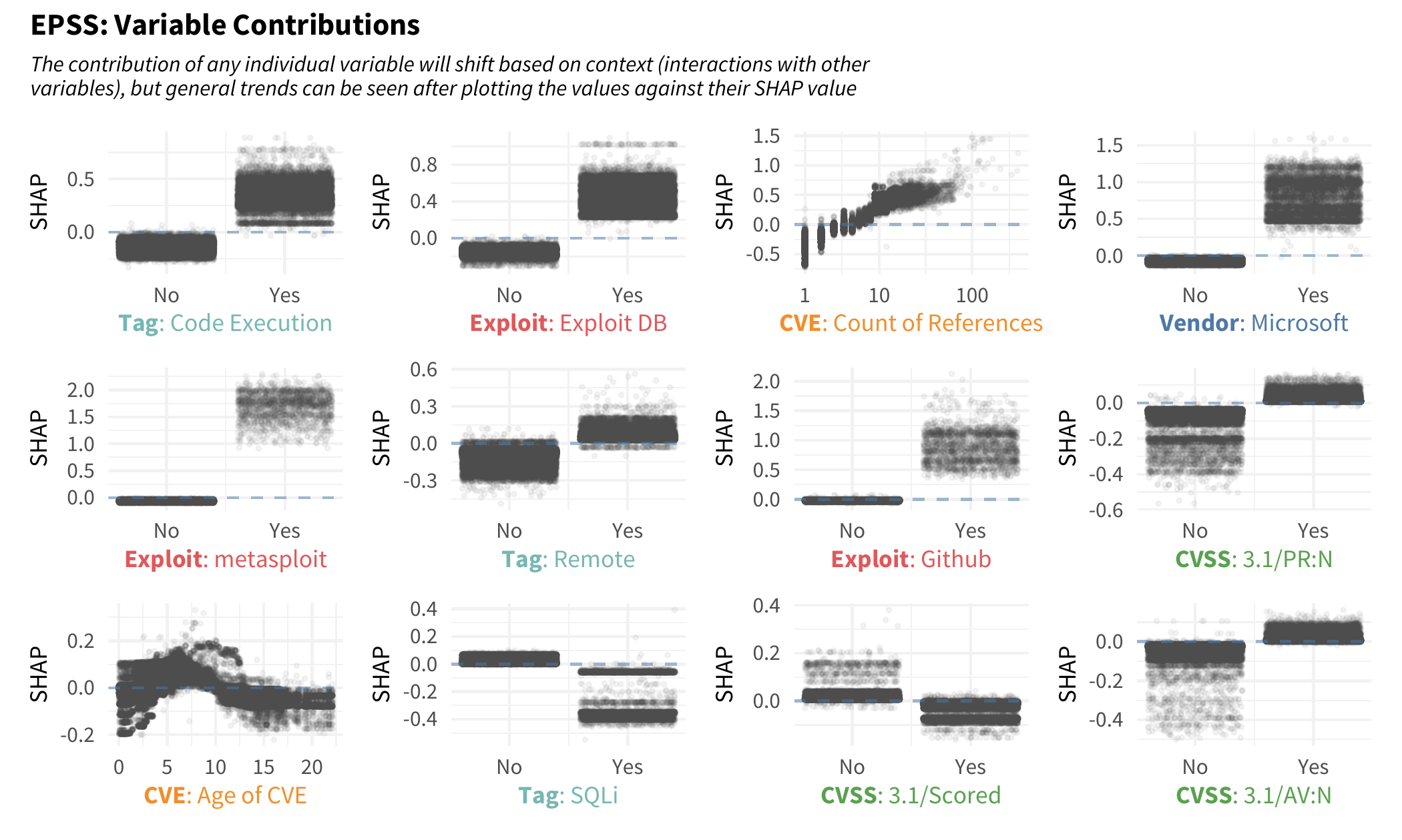
Note also the three exploit repositories. If a CVE has an exploit published to Metasploit, it has a large impact on the likelihood of observing exploitation in the wild (relatively speaking the vertical axis scale is larger for that plot). But notice also, an exploit published to github and/or exploit DB will increase the estimated likelihood for observing exploitation. Another interesting variable to talk about is the effect age has on outcome. Note that when a CVE is “new” the contribution is mixed and dependent on context, but as a CVE ages with time, there is a slight increase in exploitation which is rather interesting! It peaks around year six or seven and decreases after that, eventually becoming steady in older vulnerabilities and reducing the likelihood of observing exploitation activity.
EPSS References
Peer-Reviewed and Other Published Research
- Jay Jacobs, Sasha Romanosky, Benjamin Edwards, Michael Roytman, Idris Adjerid, (2021), Exploit Prediction Scoring System, Digital Threats Research and Practice, 2(3).
- Jay Jacobs, Sasha Romanosky, Idris Adjerid, Wade Baker, (2020), Improving Vulnerability Remediation Through Better Exploit Prediction, Journal of Cybersecurity, 6(1), https://doi.org/10.1093/cybsec/tyaa015.
- Kenna Security and Cyentia: Prioritization to Prediction Series, 2017-2022, https://www.kennasecurity.com/resources/prioritization-to-prediction-reports/
Presentations
- Exploit Prediction Scoring System, TPRC, The Research Conference On Communications, Information, and Internet Policy, February 19, 2021.
- Michael Roytman, Jay Jacobs (2019), Predictive Vulnerability Scoring System, Black Hat USA, August 3-8, Las Vegas, 2019, available at https://i.blackhat.com/USA-19/Thursday/us-19-Roytman-Predictive-Vulnerability-Scoring-System-wp.pdf.
- Jay Jacobs, Sasha Romanosky, Benjamin Edwards, Michael Roytman, Idris Adjerid (2019), Improving Vulnerability Remediation Through Better Exploit Prediction, PrivacyCon Federal Trade Commission, June 27, 2019, available at https://www.ftc.gov/news-events/events-calendar/privacycon-2019.
- Jay Jacobs, Sasha Romanosky, Benjamin Edwards, Michael Roytman, Idris Adjerid (2019), Exploit Prediction Scoring System (EPSS), 2019 Workshop on the Economics of Information Security, Boston, June 3-4, 2019.
